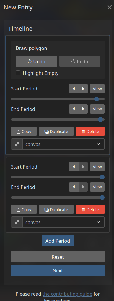
[UX Improvement] Move Draw block below/into Timeline Period block
When I added my first submission, I entirely missed that every Period in the Timeline has its own polygon.
I just intuitively interpreted the Interface as not allowing that.
This is likely because visually the interface suggests you first define the polygon of the element, and then the Timeline Periods that element is visible for. Because both are shown as direct properties of the entire element, since they are both at the root level of the edit dialogue.
The Draw being above the Timeline further goes against seeing it as a property of any given Period, which however it is.
To make it visually clear/intuitive that ever Period has its own Draw polygon, the Draw block should at minimum be below the Timeline, but better inside the currently active Period.
Separate from that it would also be good to have a better indicator for how to select a Period, some kind of area in the top left corner that looks like "click here to select this", but not in the tickbox way but in the focus way. Idk I'm not a ux designer (sadly).